PACKAGING
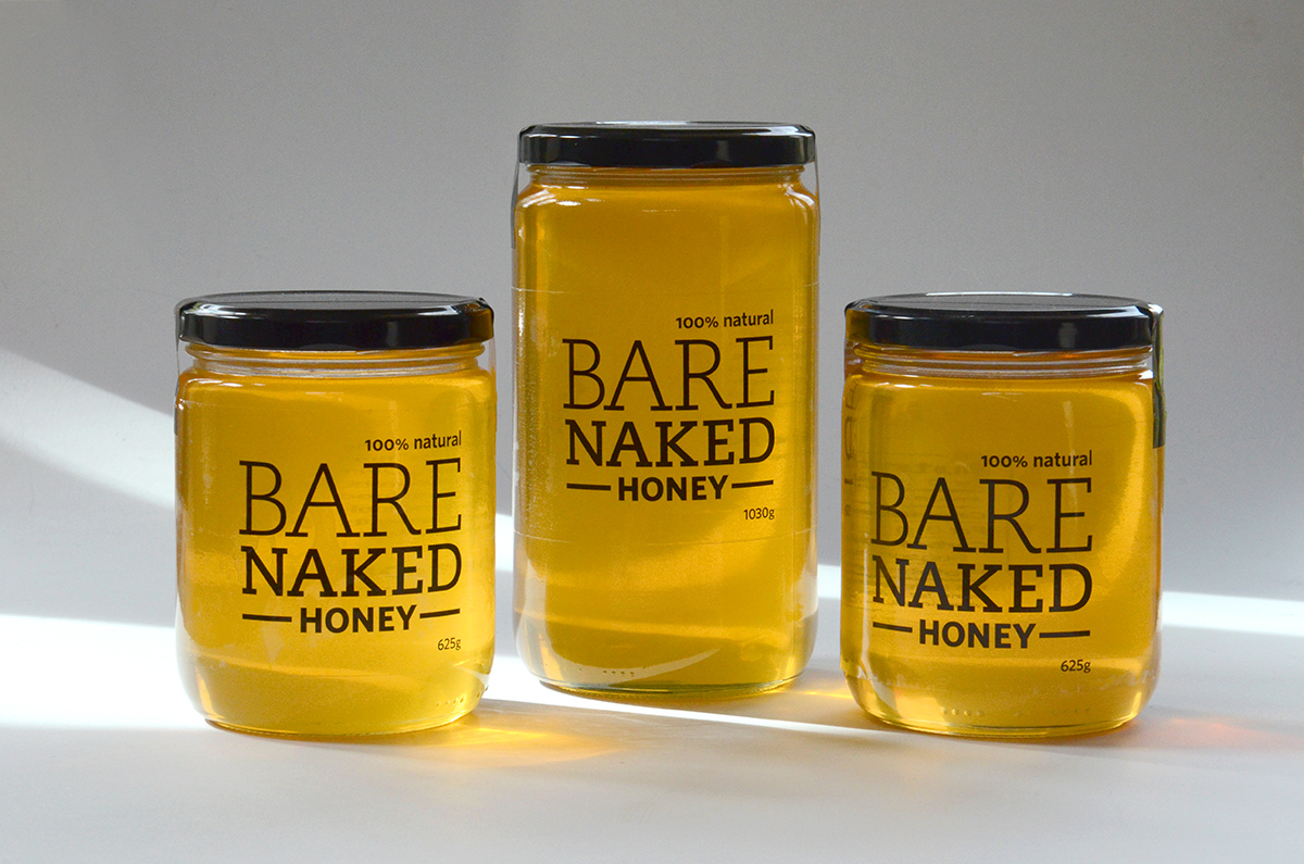
Antony and Tina at Soiled Reputation have established a thriving apiary on their organic farm, and asked us to design packaging for their honey. Punch & Judy proposed the name “Bare Naked Honey” which grabs attention, but also suggests the “nothing added” nature of the product. For their efforts, Ant and Tina were recognized with the 2017 Canadian Farmer Pollinator Conservation Award from the American Farm Bureau Federation at a ceremony in Washington DC.
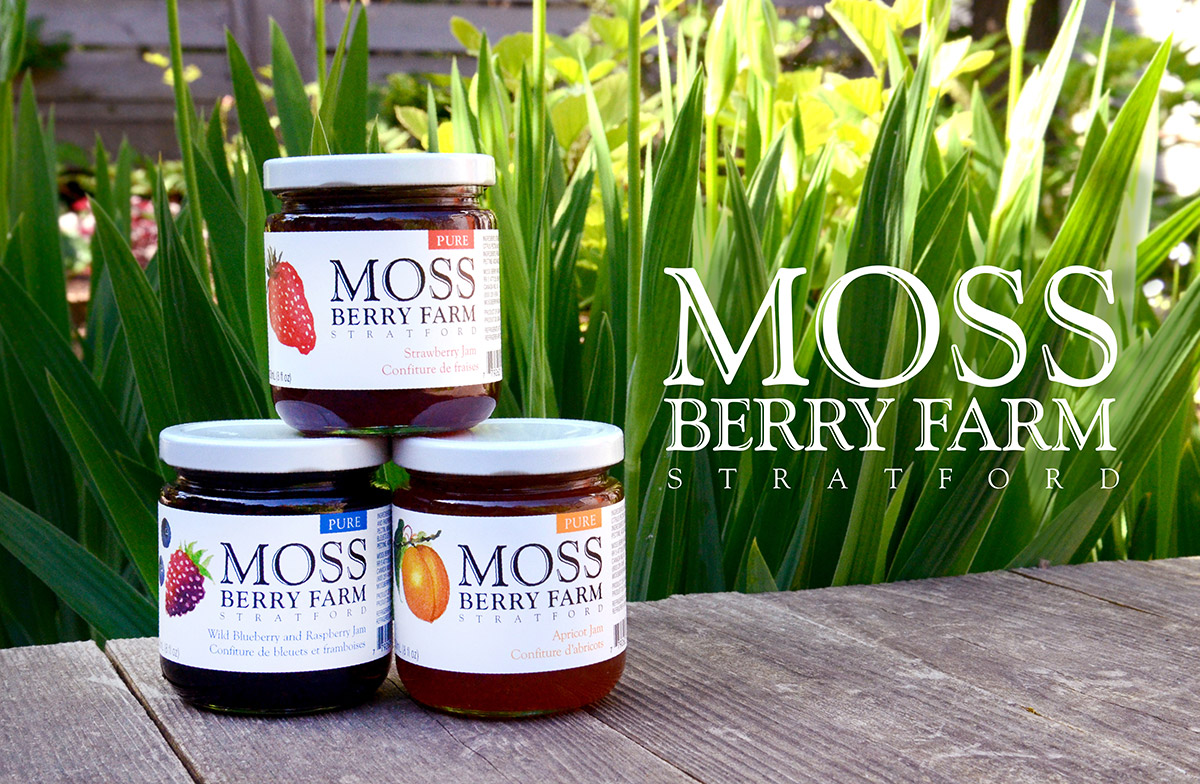
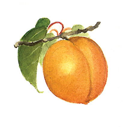
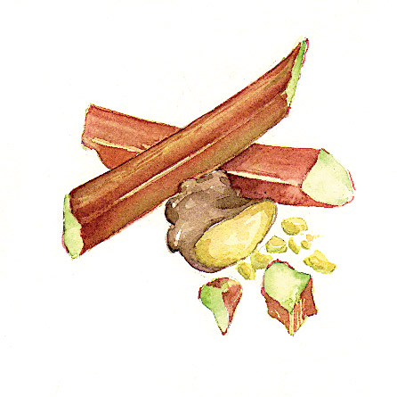
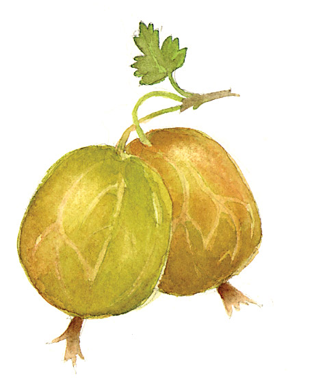
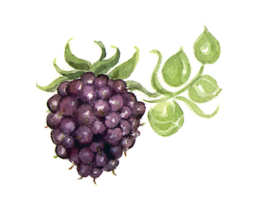
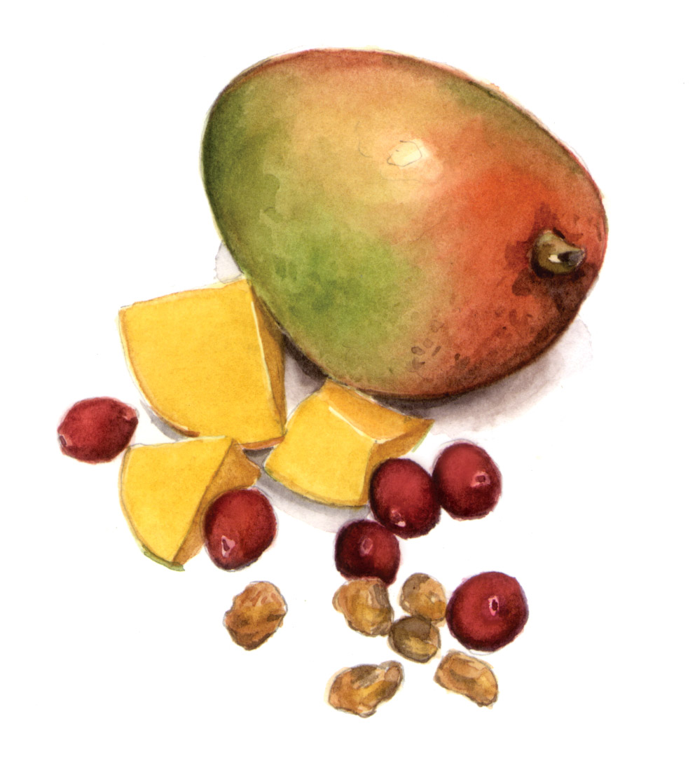
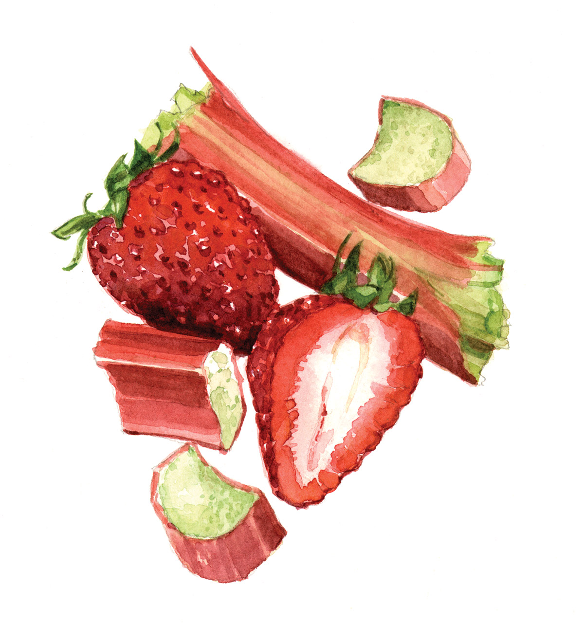
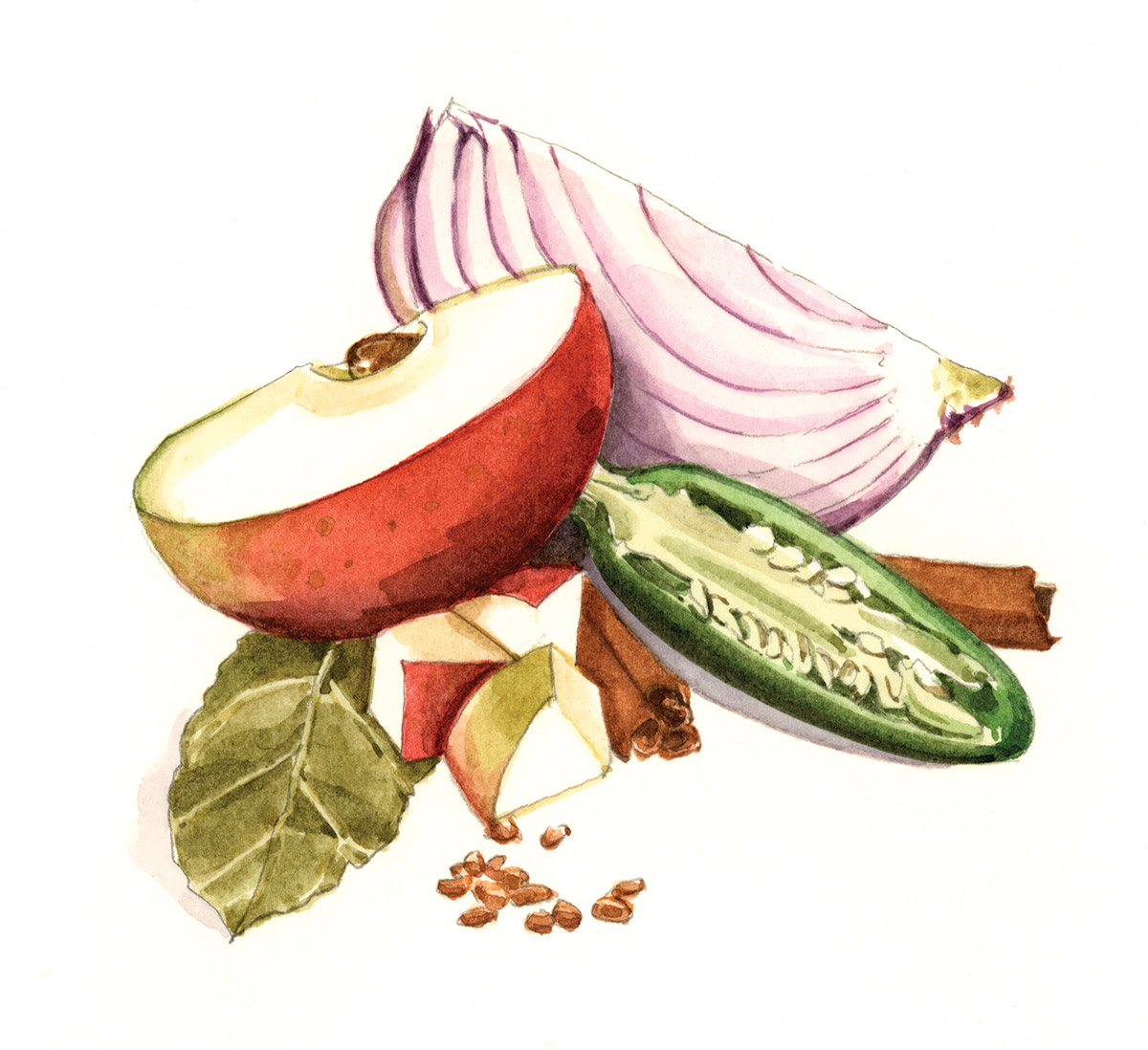
Punch & Judy has designed packaging for Moss Berry Farm for more than two decades. Christina Poddubiuk created watercolor illustrations for each of the Moss jams and chutneys.
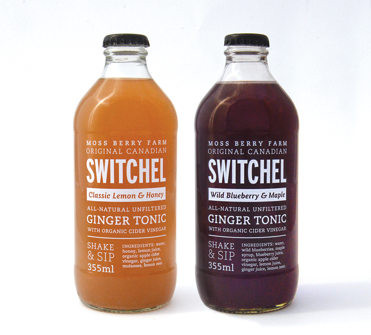
Moss Berry Farm introduced a new product line in 2016 — Switchels. Sometimes called Haymaker’s Punch, this traditional 19th-century beverage combines cider vinegar and ginger (so it has a bit of a kick!), and was prized for its natural hydrating and healing benefits. Punch & Judy designed the bottle labels, mindful that the name of the product would be unfamiliar to most people. Inspiration came from traditional 19th-century labels but those sources were reinterpreted for a contemporary market.
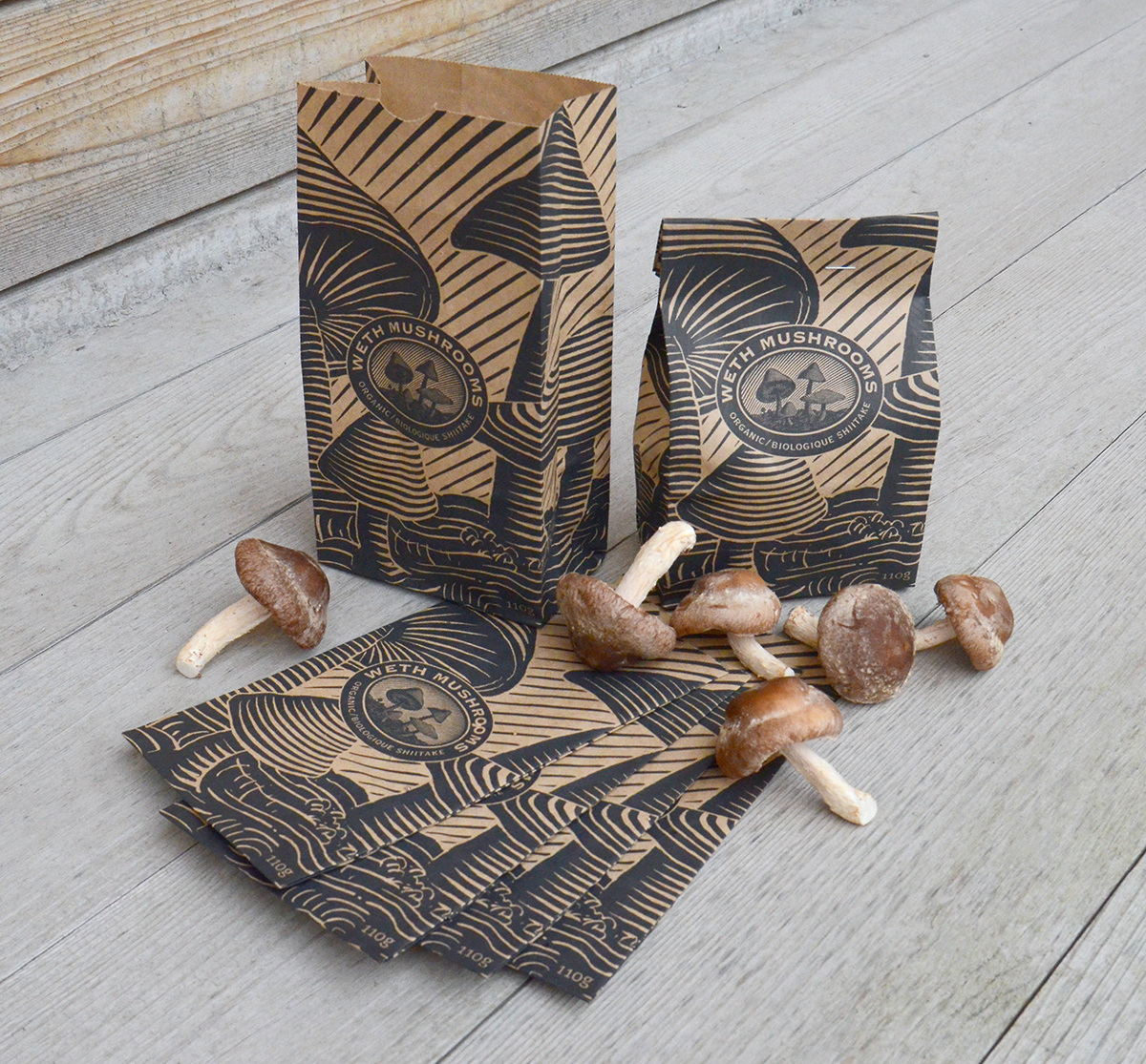
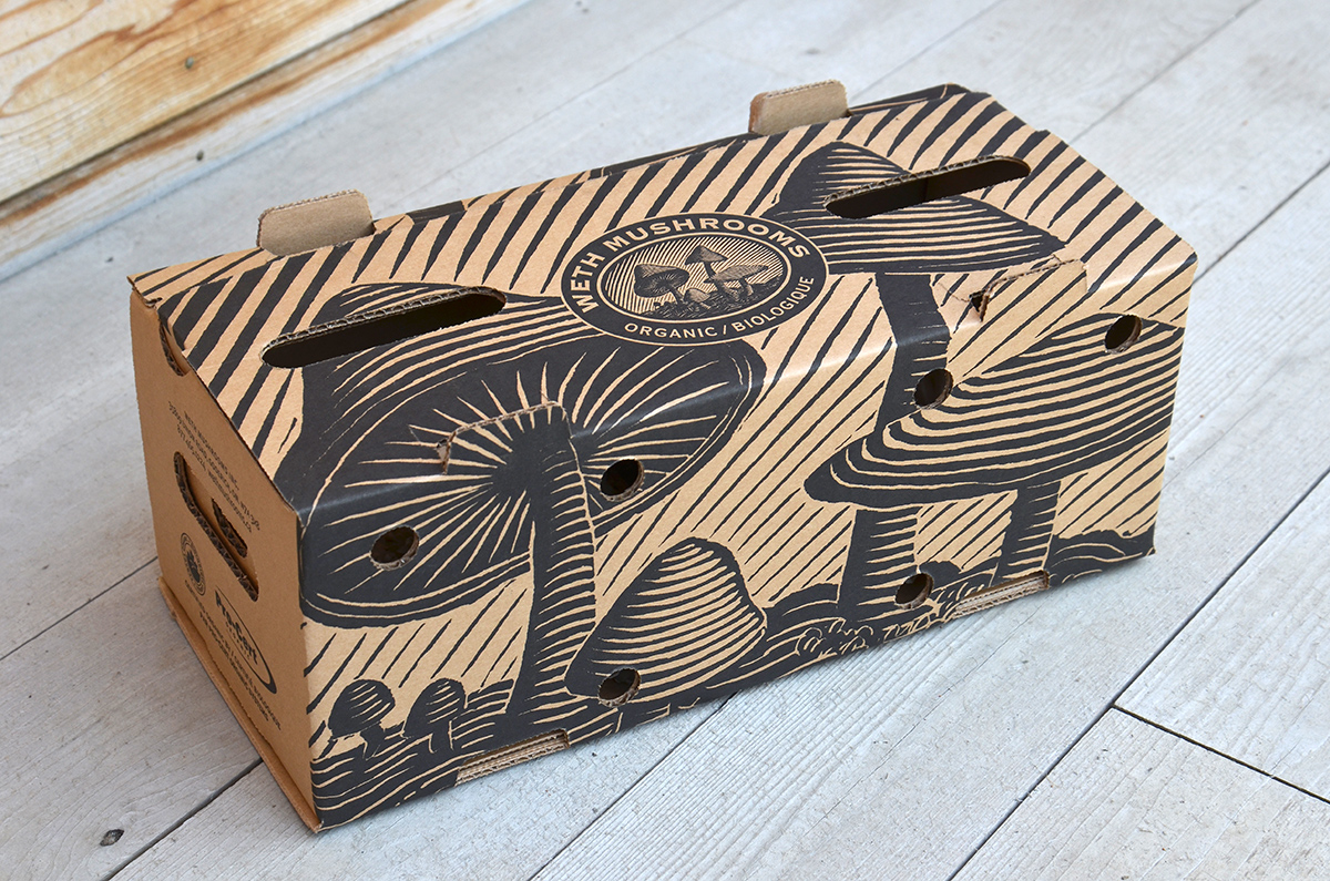
Ryan and Susan Weth run an organic mushroom farm in Goderich, supplying farm markets and high end restaurants across Ontario. Punch & Judy has designed their graphics — and enjoyed their fine products — for more than two decades. Scott created a scratchboard illustration for their logo, which was later blown up for application on bags and boxes as Weth Mushrooms expanded.
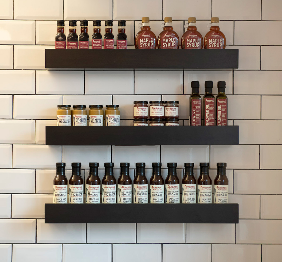
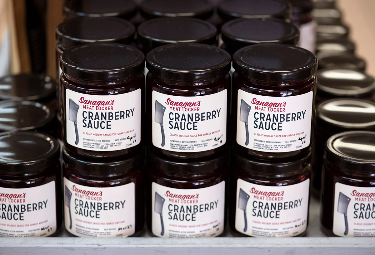
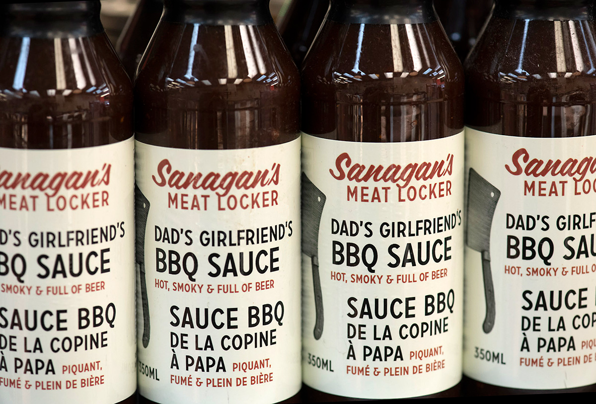
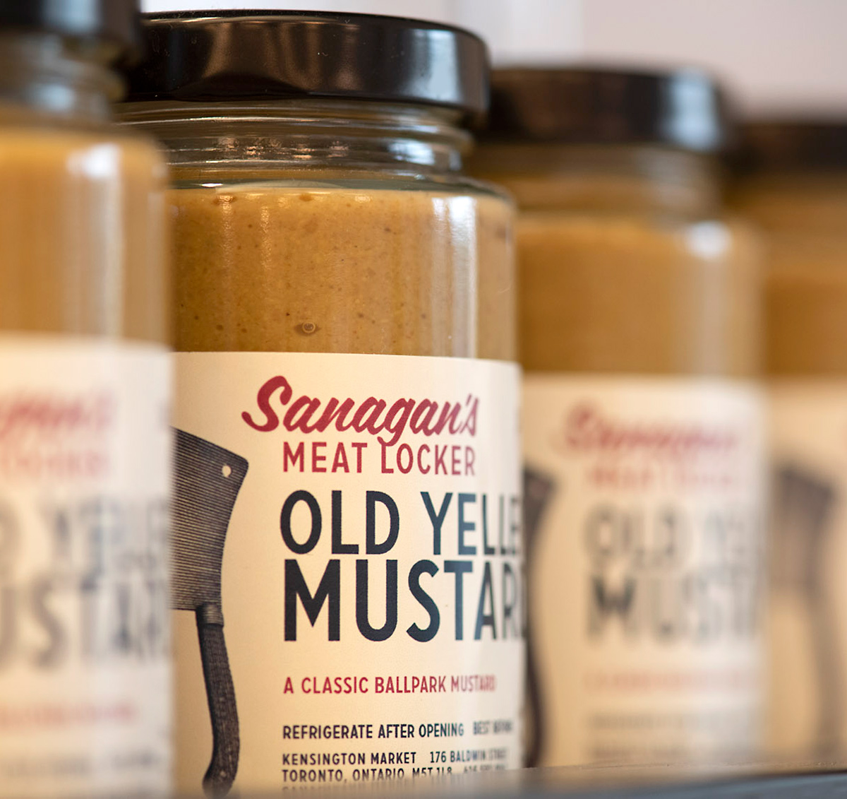
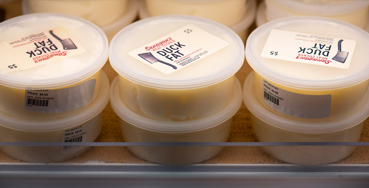
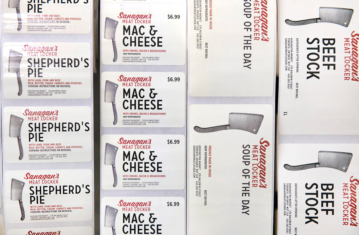
In addition to spectacular fresh meats and charcuterie, Sanagan’s Meat Locker offers a collection of high quality, small batch foodstuffs developed by independent Ontario producers under its in-house label Sanagan’s County Line. Products include Black Garlic, Honey Vinegar, Wild Elderberry Jelly, Plum Jam, Sunflower Oil, Maple Syrup and Birch Syrup. Other exclusive products and comestibles are made in the Sanagan’s kitchens. Punch & Judy has designed labeling systems for a wide range of jars and bottles since Sanagan’s first opened its doors in 2009.intro text
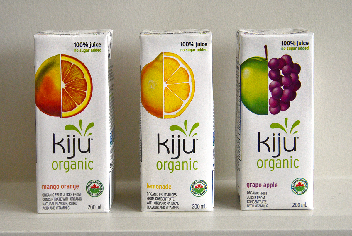
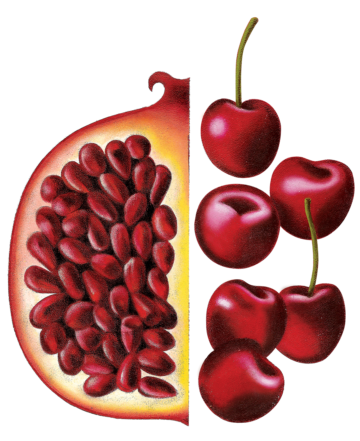
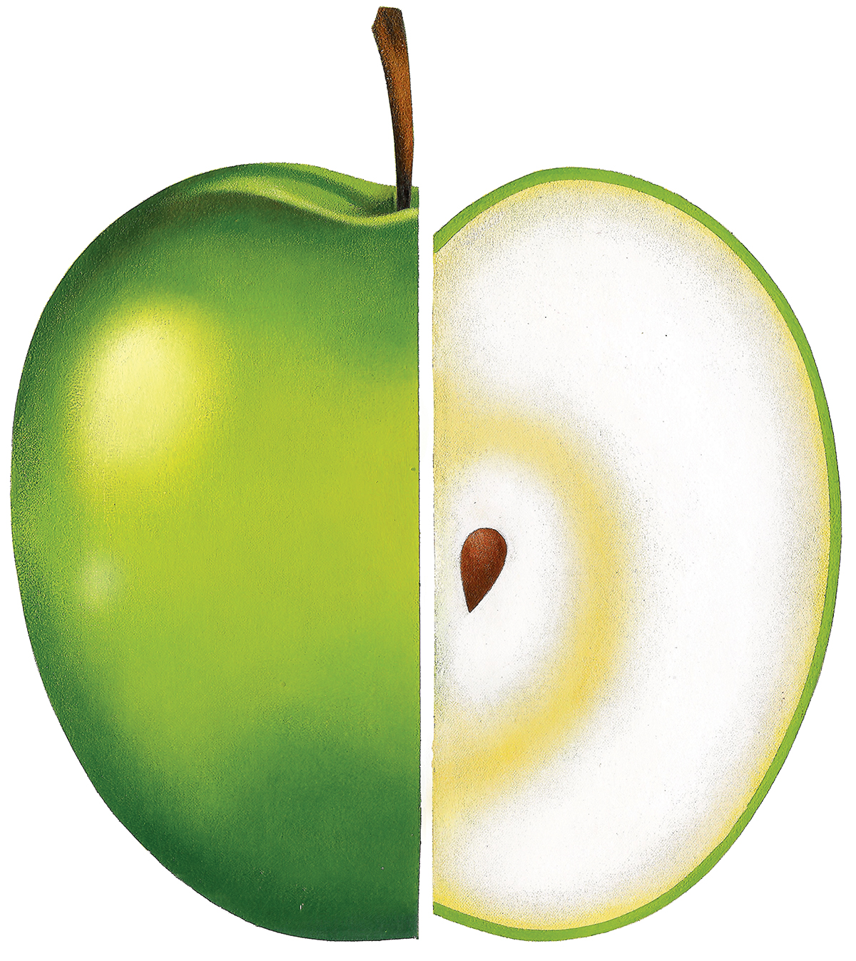
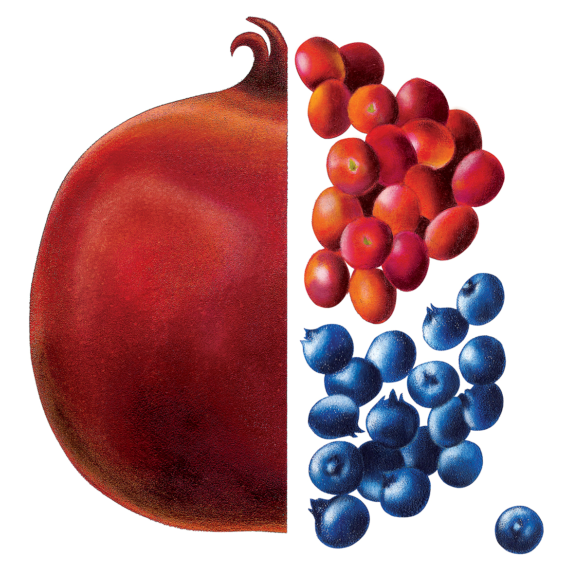
Punch & Judy was asked by Christine Guy at Pollen Communications to redesign beverage packaging for her client, Kiju. We collaborated on several projects including a streamlining of the logo and packaging for iced teas and coolers. Shown here is their popular line of tetra-pack juices — Kiju had established the product with a series of unfortunate cartoon-style illustrations, and our assignment was essentially to upgrade the packaging. Punch & Judy redesigned the boxes and commissioned Pete Ryan to create these illustrations.
