IDENTITY
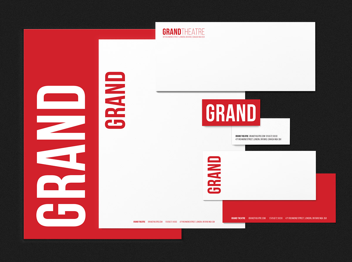
Scott’s professional career started at the Grand Theatre in London, Ontario, in 1984 when he was hired as resident poster designer. He created marketing materials for eleven seasons under four artistic directors – Don Shipley, Larry Lillo, Martha Henry and Michael Shamata – so when Dennis Garnhum invited Scott to create posters and brochures for the Grand in 2017, it was something of a homecoming. His first assignment was a rebranding which included interior and exterior signage.
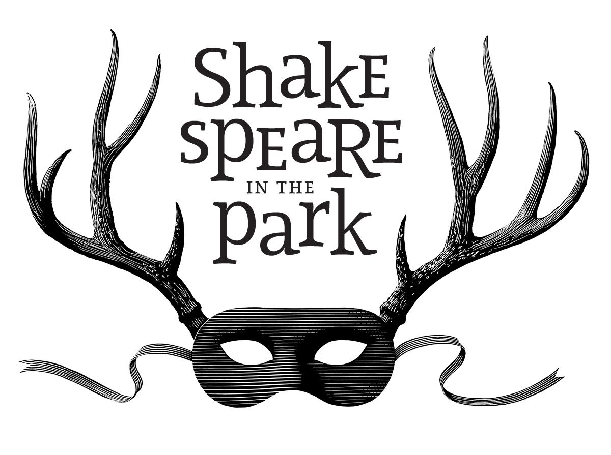
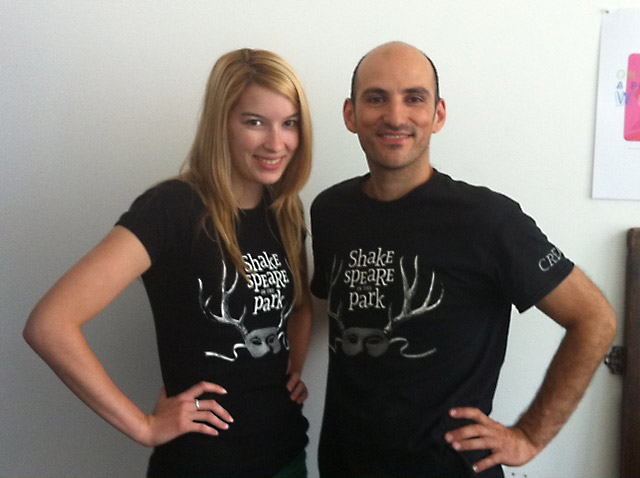
In 2012, Repercussion Theatre in Montreal asked Scott to rebrand their popular Shakespeare-in-the-Park program which has presented outdoor theatre across the city for 30 years. Many of the plays — Love’s Labour’s Lost, Merry Wives, As You Like It — include “park” scenes in which deer are part of the story. Antlers are reminiscent of tree branches, so they are used here to evoke a magical park setting. The mask adds the theatrical context — the intentionally dark, sexy edge is balanced by playful typography in the space above the mask.
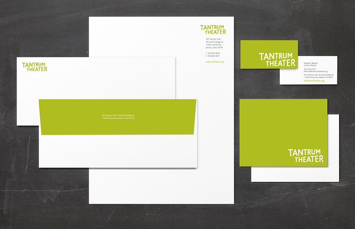
Tantrum Theatre is a professional company attached to Ohio University. The name comes from the collective noun for a group of Bobcats, which is the school’s mascot. We loved the witty association, but we were mindful of the potential negative connotation of the more common meaning — an uncontrolled outburst of childish anger. Through design, we emphasized the positive aspects of the word — its playful energy and bold dynamics — and eliminated the negative. The “megaphone” shape of the wordmark maps the range of spoken dialogue on the stage from the loudest exclamation to the softest whisper.
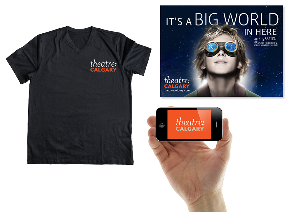
Punch & Judy’s concept for a new Theatre Calgary logo was inspired by years of reading scripts. Every line of dialogue in printed text is preceded by the character’s name and a colon – often in a contrasting typeface to the lines the playwright gives them to speak. Theaters are literary institutions (even if they don’t like to market themselves that way) and Scott was intrigued by the opportunity to make a visual connection with the words spoken on stage. He explored juxtapositions of THEATRE: CALGARY in contrasting fonts – a serif italic in upper and lower case, and a sans-serif in all caps — connected by a colon. The fonts make reference to the mix of plays in each season – classics, side by side on the playbill with contemporary works.
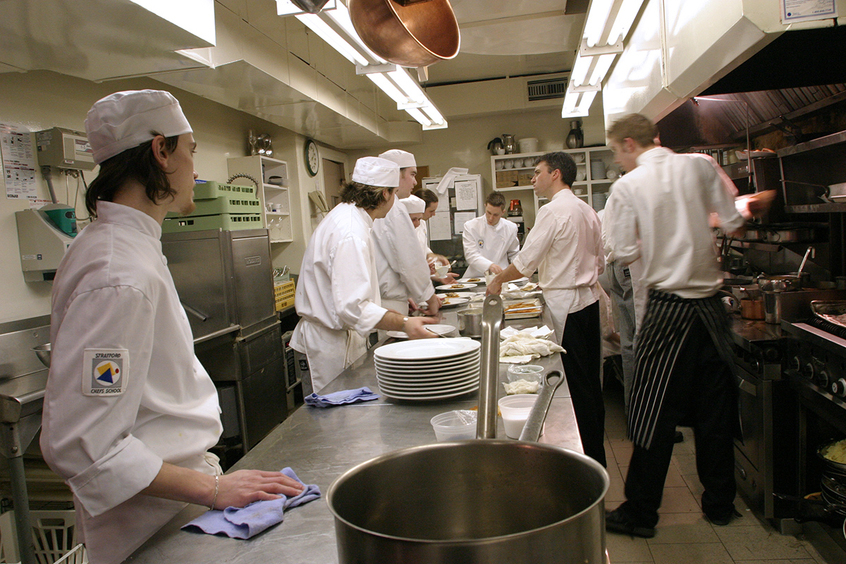
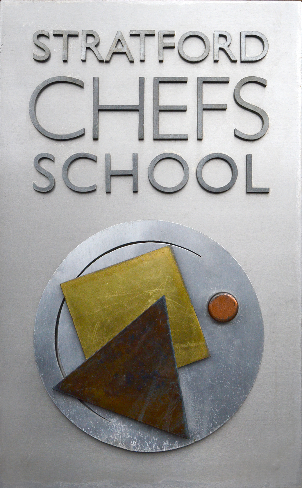
The Stratford Chefs School is a non-profit career college focussed on the innovative hands-on training of aspiring chefs and culinary entrepreneurs. It was founded in 1983 by James Morris and Eleanor Kane, who asked Scott to design the graphic identity for the fledgling enterprise. The logo was comprised of a circle, a triangle and a square – the most basic geometric shapes — in primary color red, blue and yellow — to suggest the idea of combining basic food elements on a plate. This idea actually came from the curriculum: students used cutout paper to study the visual composition of plating food. The logo appeared in print, in electronic media, and embroidered on uniforms and service jackets. For the School's 25th anniversary in 2008, Punch & Judy reworked the logo using metallic colors. Ken Dubblestyne, one of the prop builders at the Stratford Festival, created exterior signage for the School’s offices using aluminum, brass, copper and stainless steel.
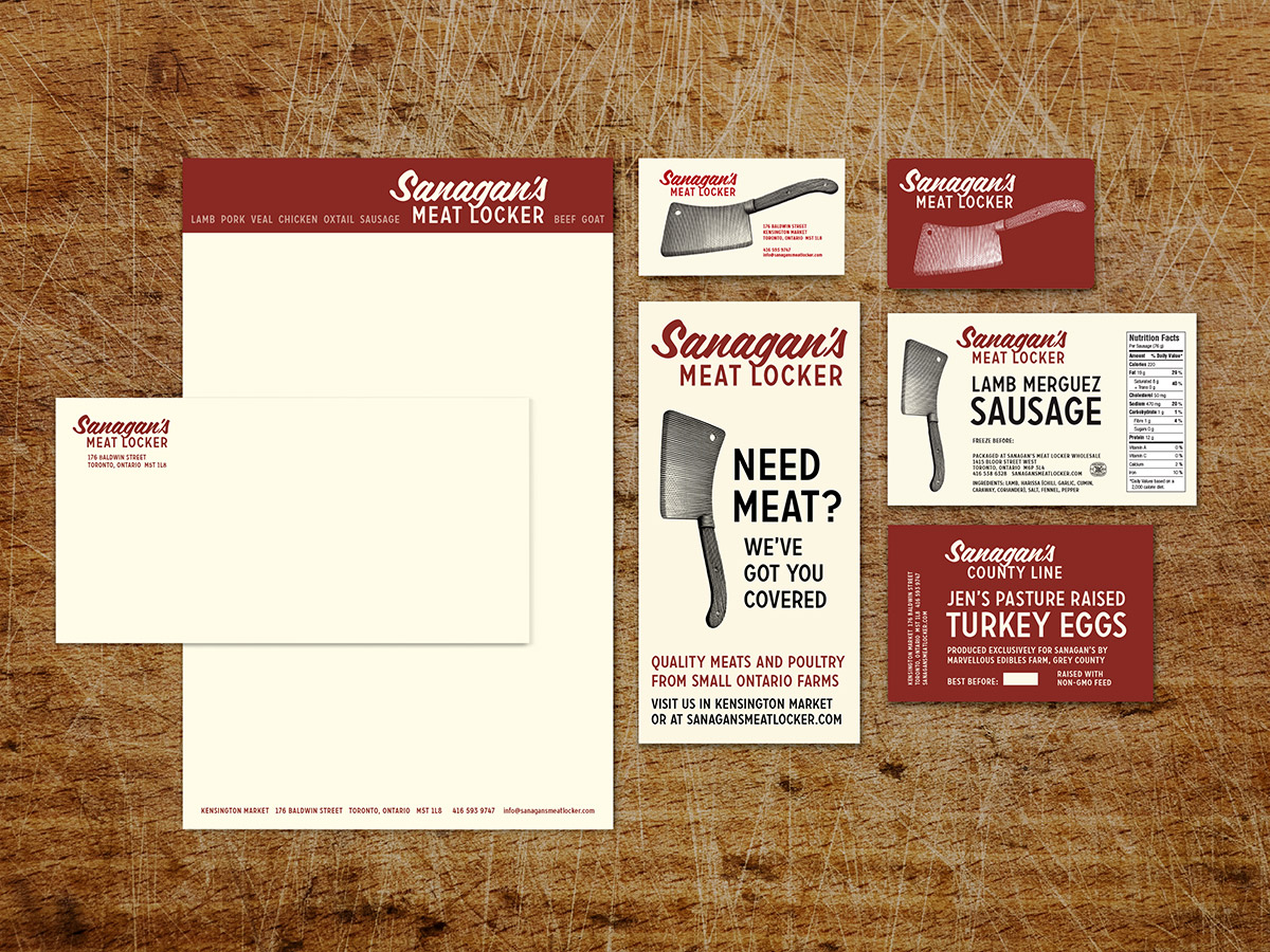
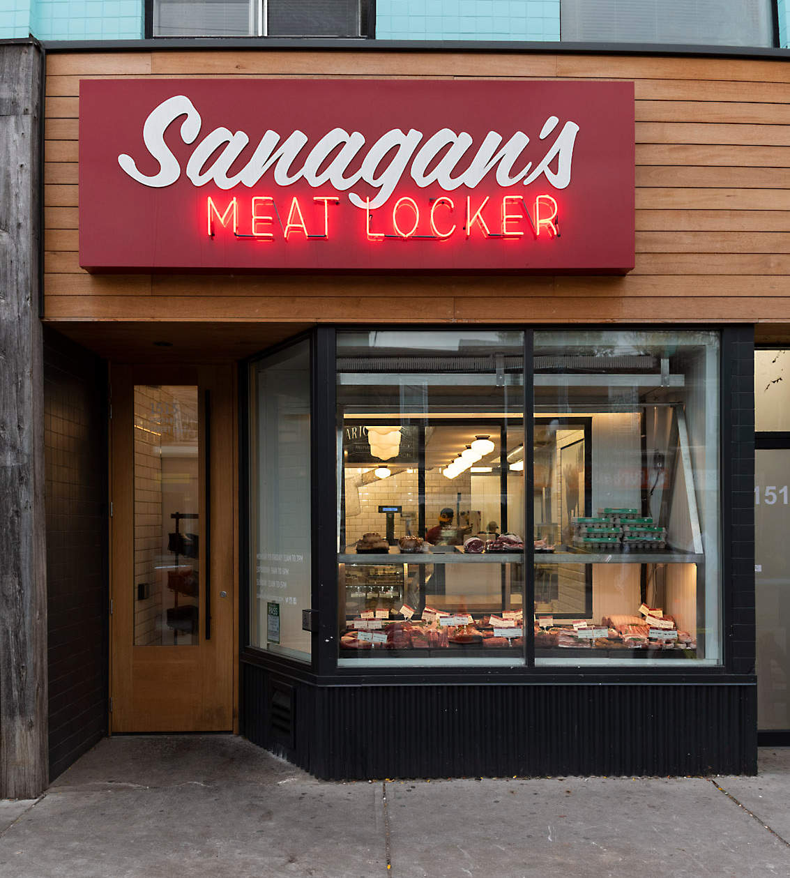
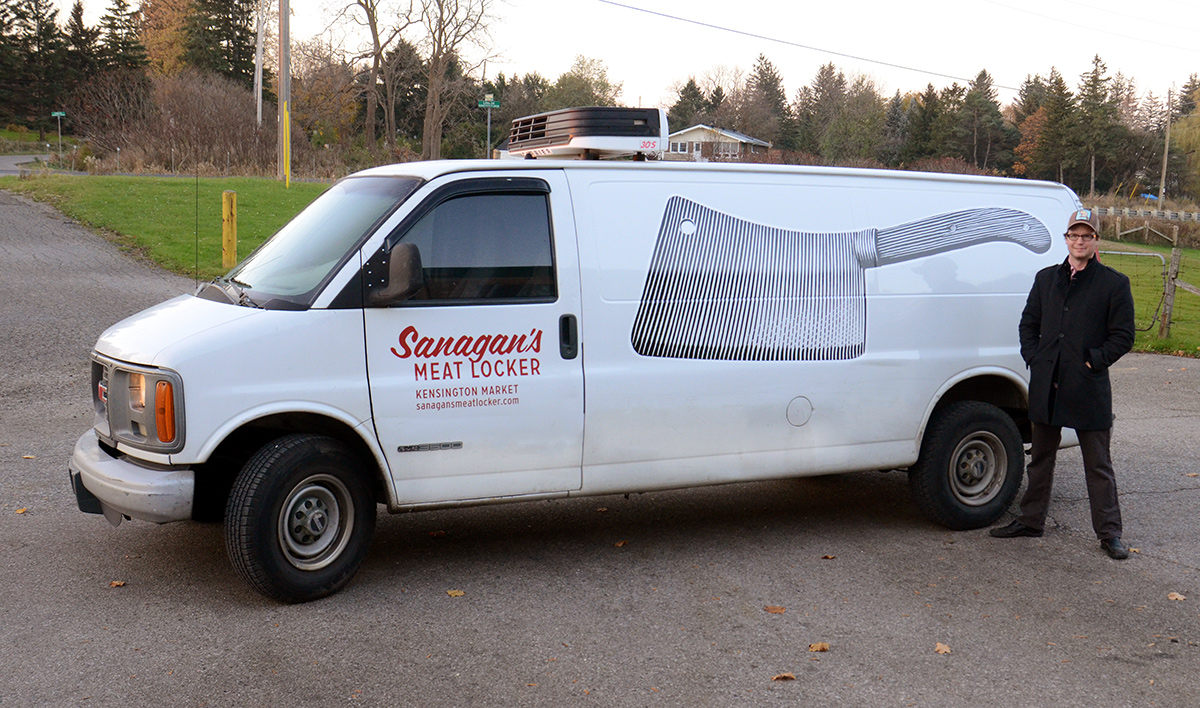
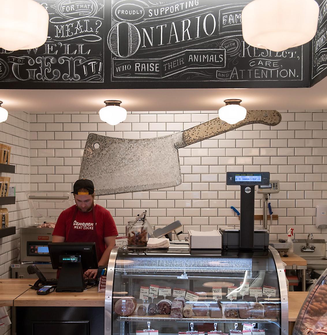
When Peter Sanagan asked Punch & Judy to think about a logo for his tiny butcher shop in Toronto’s Kensington Market in 2009, Scott suggested a simple meat cleaver. The engraving lines felt traditional, and allowed for the rendering of light reflections on the metal which define the beveled edge of the blade. Three years later, Peter moved from his 500-square-foot-store to a 5000-square-foot-store half a block away. Shortly after that, Toronto Life picked Sanagan’s Meat Locker as the best butcher shop in Toronto. The cleaver has appeared on labels and signage, clothing, vehicles, and most recently as a nine-foot tile mosaic in Peter’s second shop on Gerrard Street in the East End.
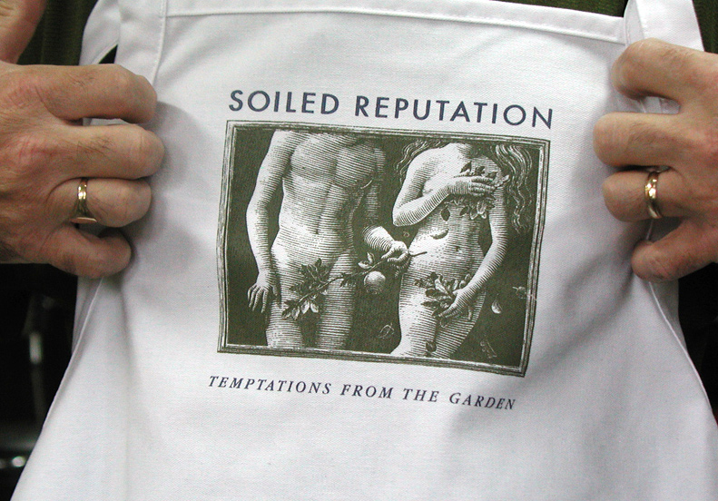
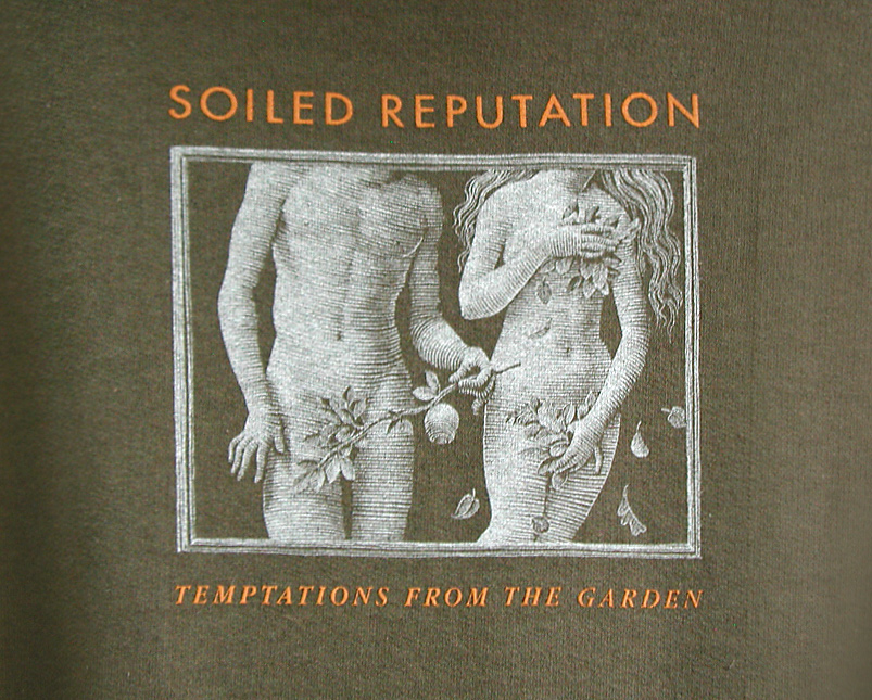
Antony John and Tina VandenHeuvel are pioneers of organic farming in southwestern Ontario, supplying superb quality vegetables and salad greens to the top restaurants in Stratford, Toronto and Niagara. Punch & Judy developed their graphic identity — Christina suggested placing the name “Soiled Reputation” (with their tag line “Temptations from the Garden”) in the context of Adam and Eve, evoking the original organic garden in the book of Genesis. Scott's engraving appears on their packaging, signage, shirts and aprons.
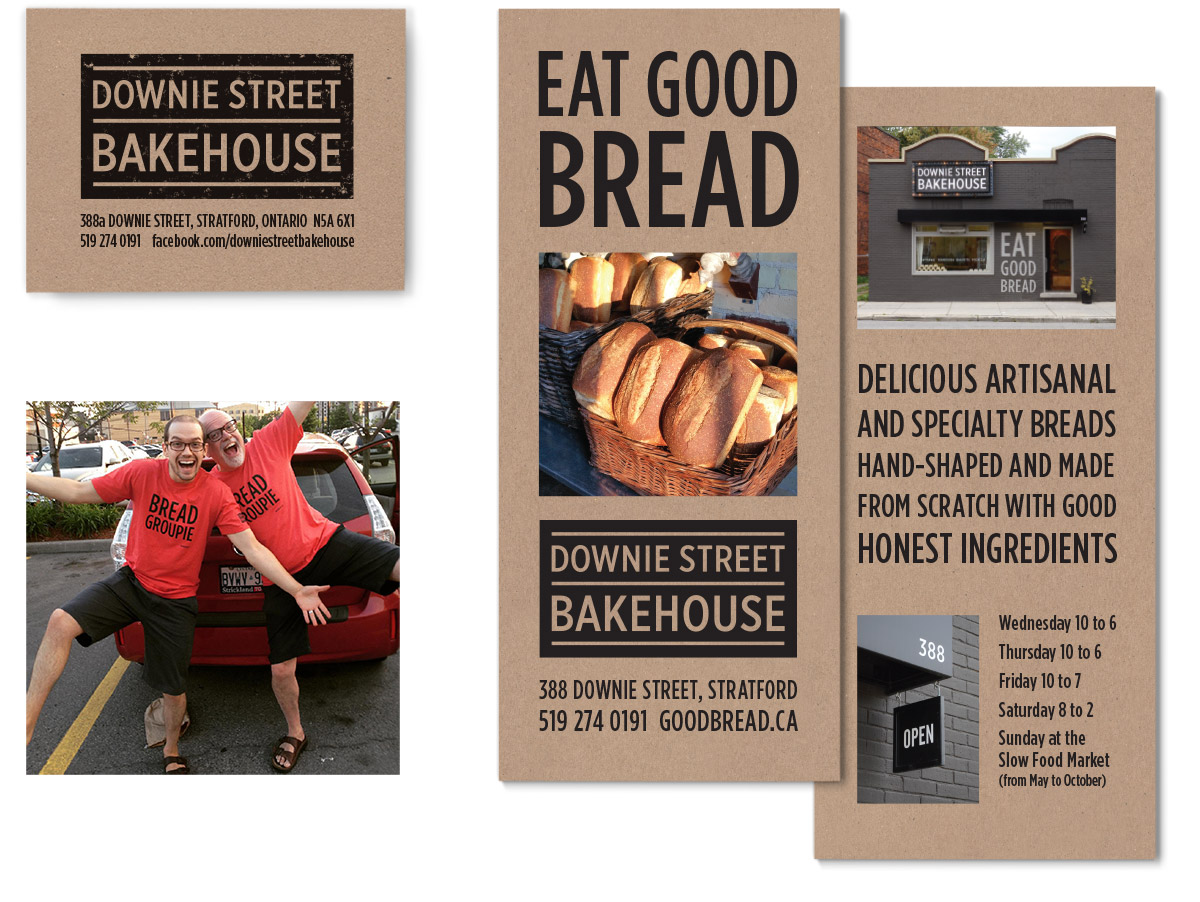
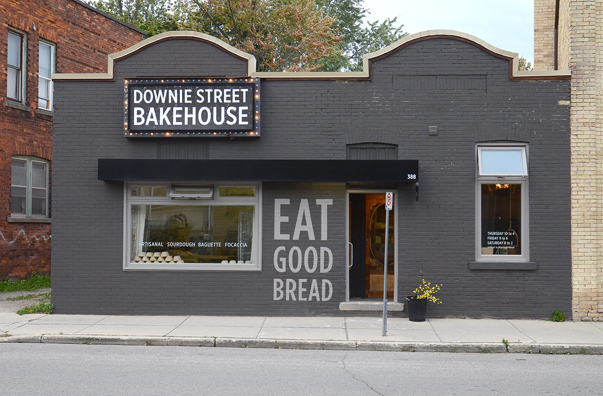
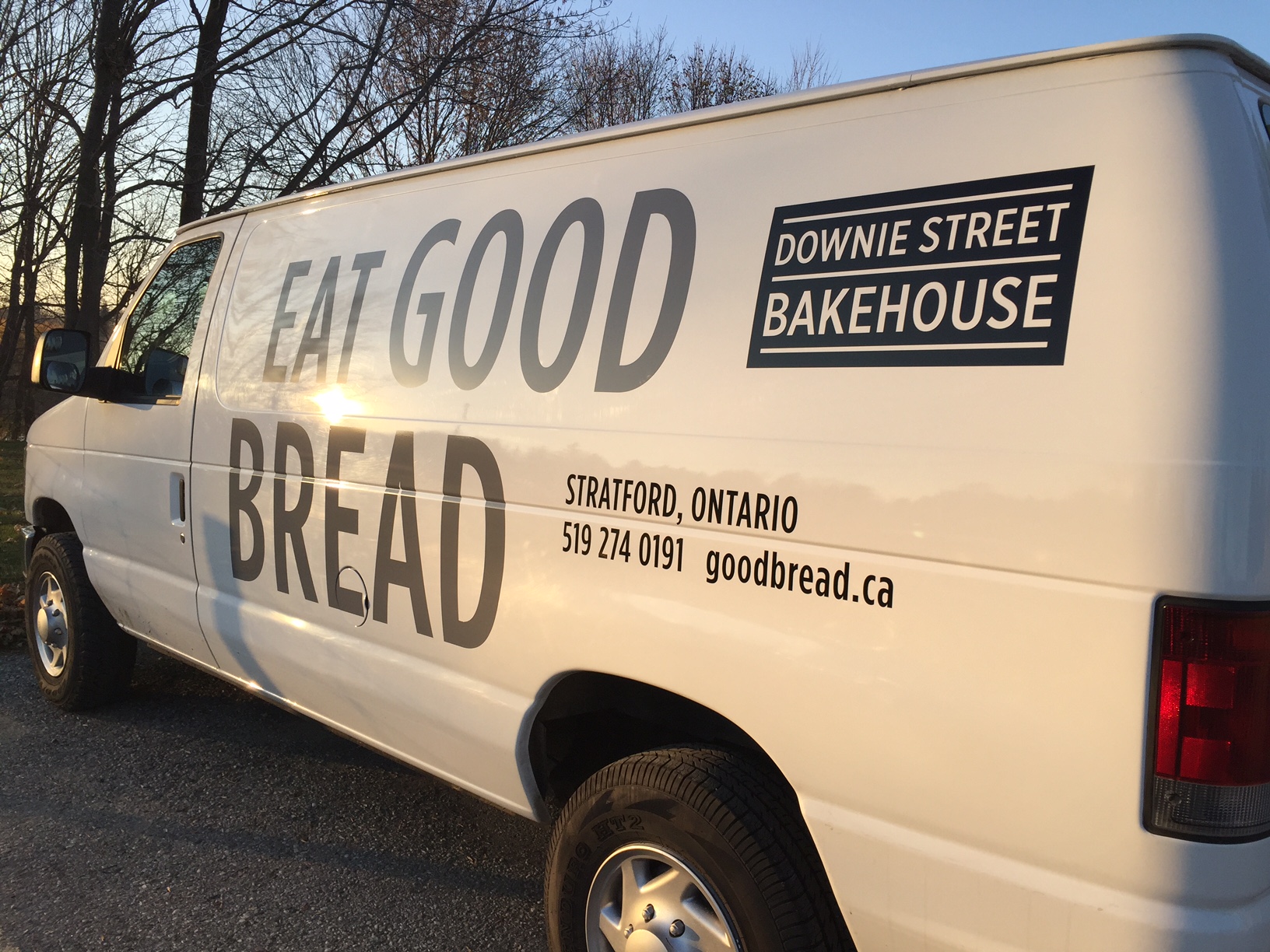
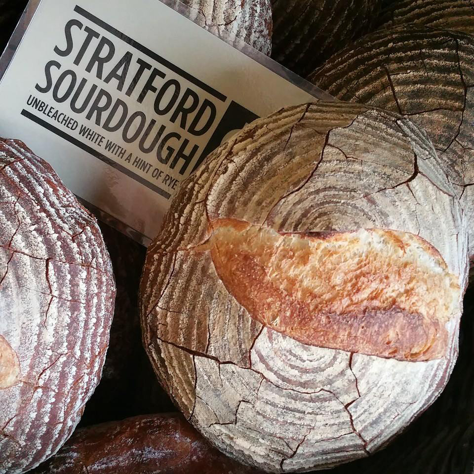
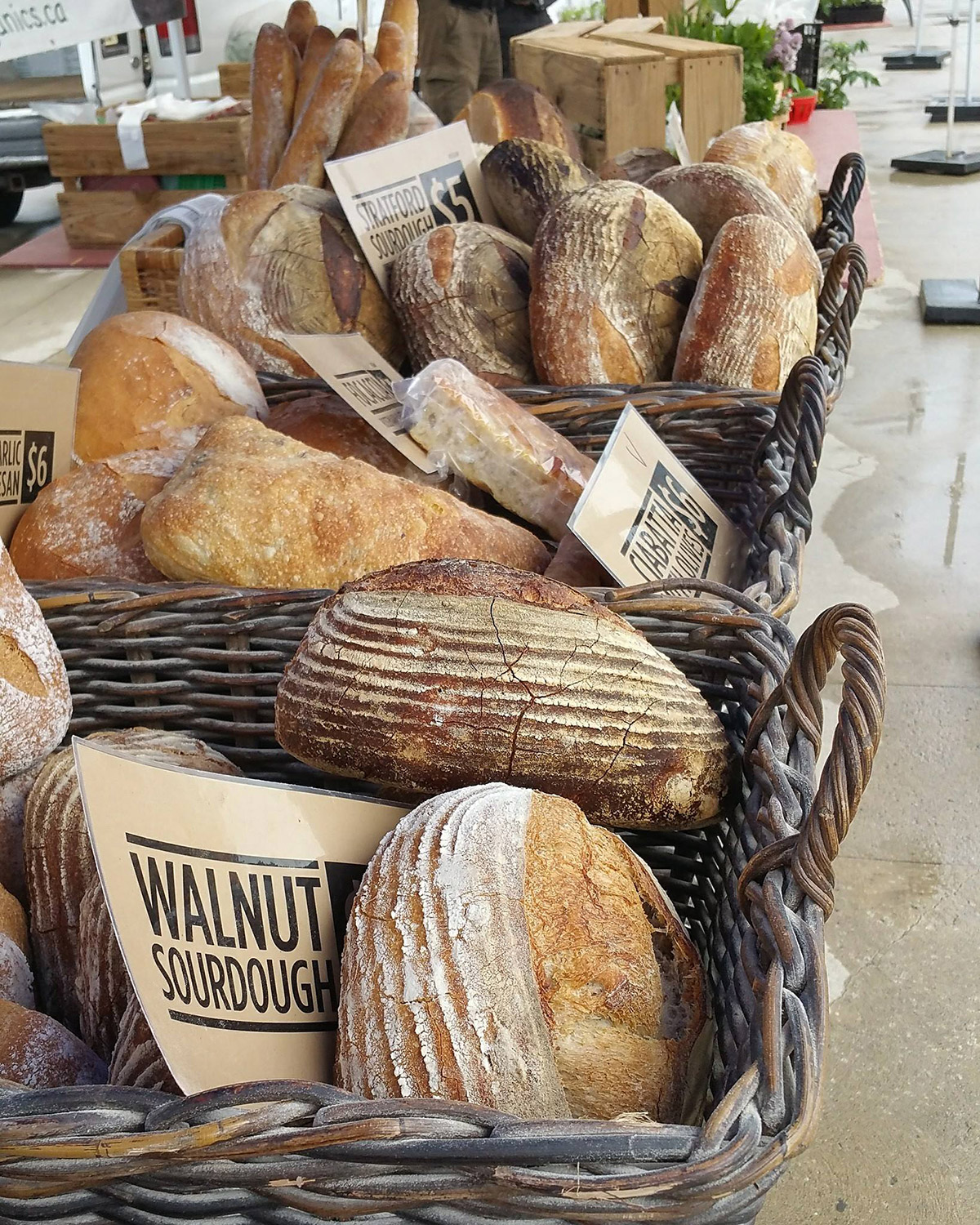
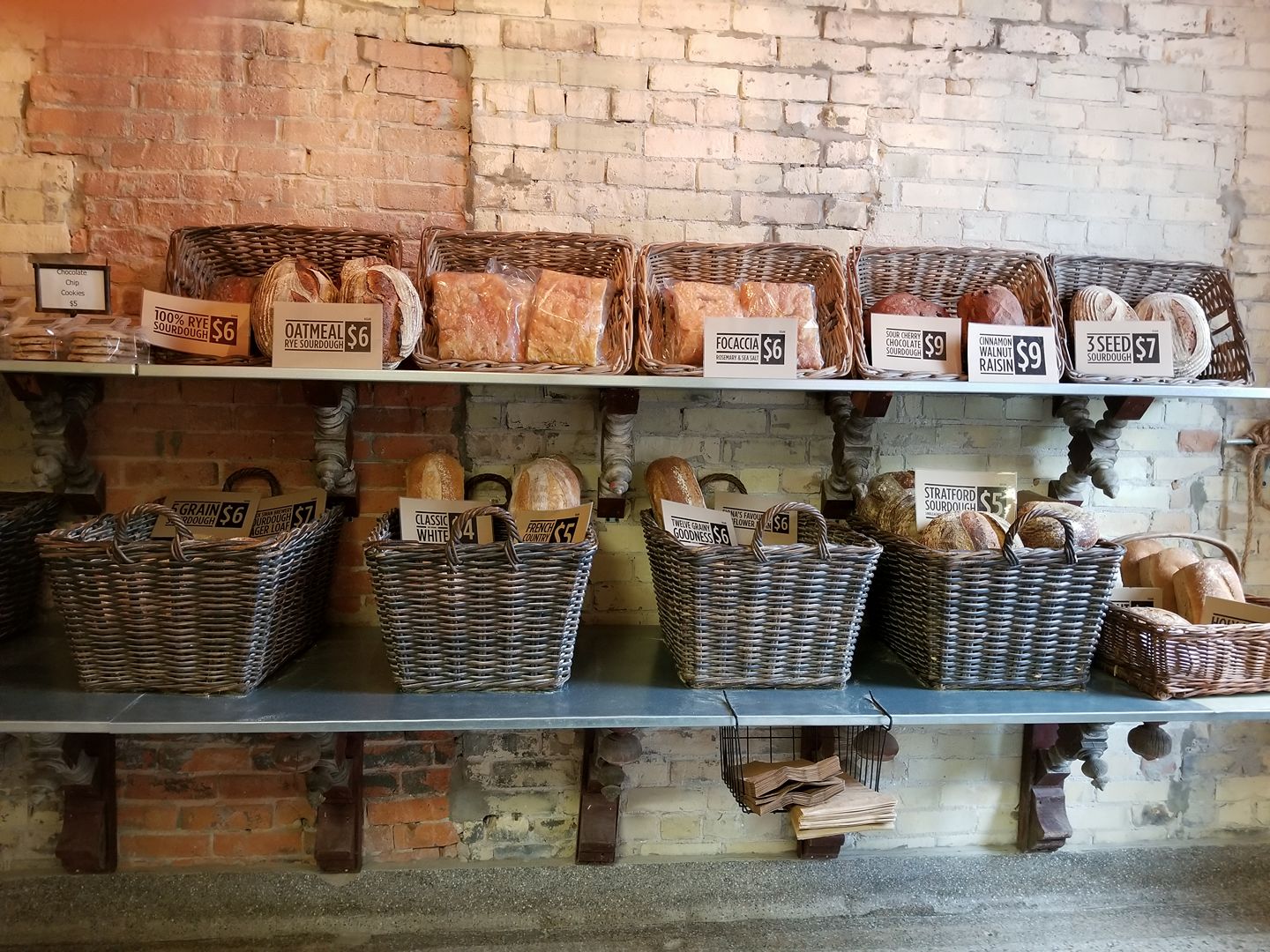
Alan Mailloux and Barb McMahon opened their thriving bread bakery in 2011 on Downie Street in Stratford, Ontario — conveniently around the corner from the Punch & Judy studio! We have designed marketing graphics, signage, t-shirts, vehicle graphics and displays for the shop and also for use at farmers market stalls in Stratford, London, Waterloo and Woodstock. Scott hand-painted the “Eat Good Bread” tagline on the brick facade using his mother’s old sign painting brushes.
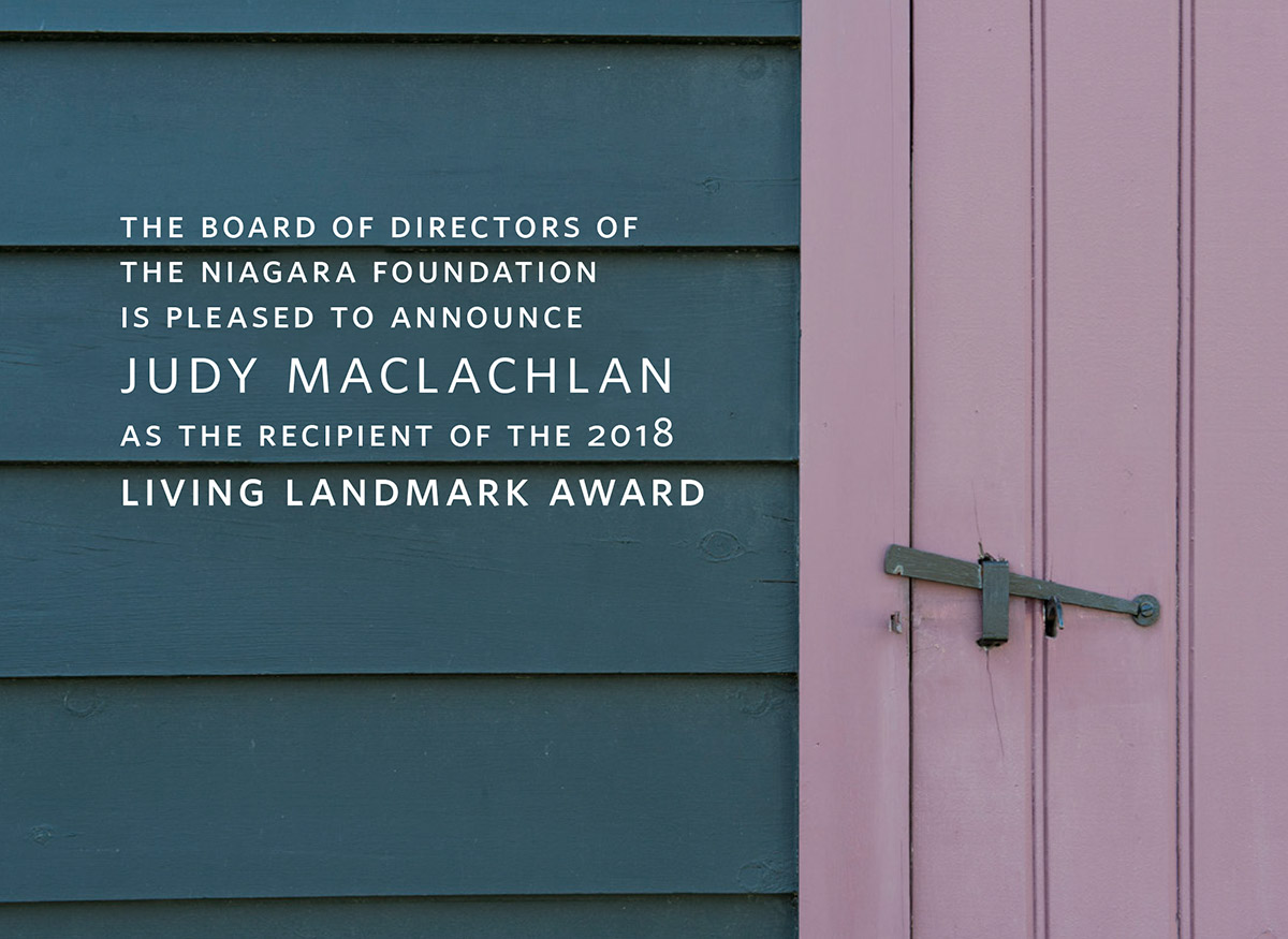
The Niagara Foundation is a non-profit foundation dedicated to the preservation of architectural heritage in Niagara-on-the-Lake, Ontario. The group plays an important role in a small town renowned for superb buildings preceding the War of 1812. The Foundation was still using a logo created in 1962 (a heraldic crest!) when they contacted Punch & Judy in 2011 to discuss a new corporate identity.
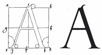
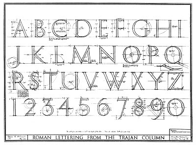
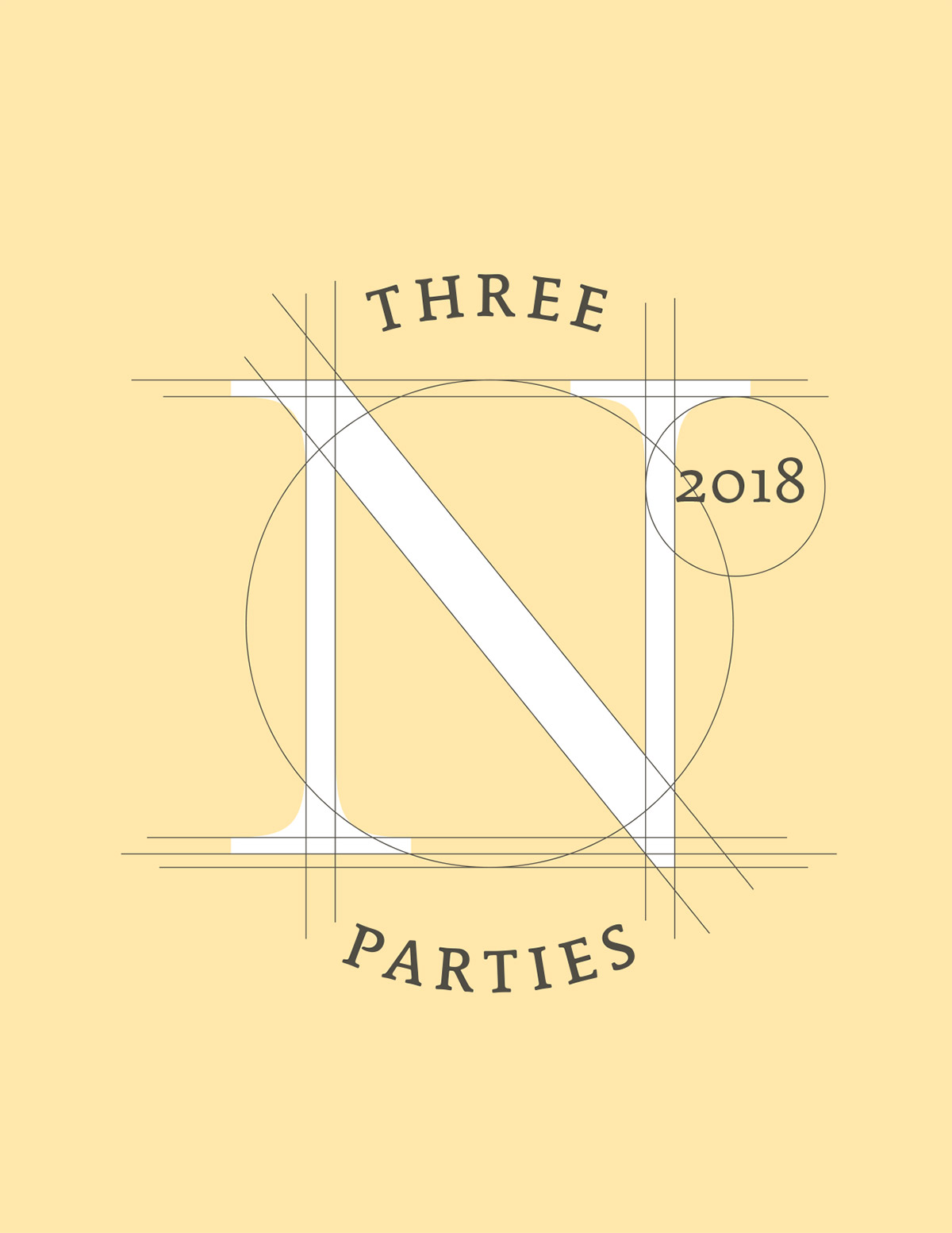
The history of typography parallels the history of architecture in its "formal" language of proportion. The grid guidelines and radius lines of the curves feel immediately architectural, recalling the golden section. The initials "N F" were uncomfortably close to "Niagara Falls" so Scott proposed a logo based on a serif capital N.


