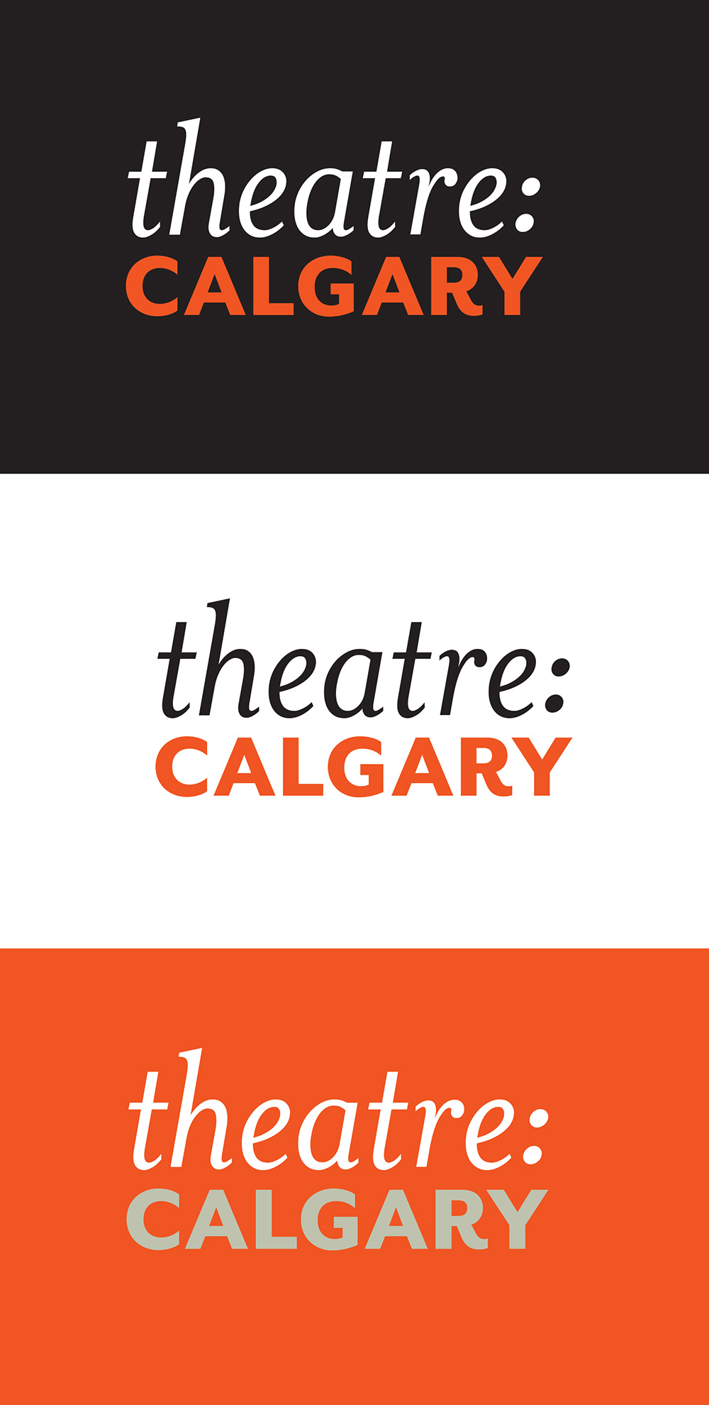
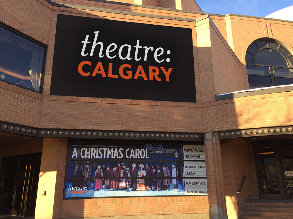
Punch & Judy’s concept for a new Theatre Calgary logo was inspired by years of reading scripts. Every line of dialogue in printed text is preceded by the character’s name and a colon – often in a contrasting typeface to the lines the playwright gives them to speak. Theaters are literary institutions (even if they don’t like to market themselves that way) and Scott was intrigued by the opportunity to make a visual connection with the words spoken on stage. He explored juxtapositions of THEATRE: CALGARY in contrasting fonts – a serif italic in upper and lower case, and a sans-serif in all caps — connected by a colon. The fonts make reference to the mix of plays in each season – classics, side by side on the playbill with contemporary works.


